 |
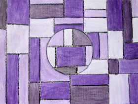
| Top: My 6 year old's, Middle: My 8 year old's, Bottom: Mine :-) |
Okay, let's start with the first part of the project. Creating a shape and lines.
We used a ruler, pencil, and oil pastel to make a shape in the center, then drew only vertical and horizontal lines to fill in the paper. I experimented with black crayon and pastel and thought the pastel would resist the paint a bit more. So we went with that. I'm sure black crayon would work almost as well and be a cleaner alternative.
My original plan was for us to use one color and just keep adding white to create a color value image. However, this was the first time we used our new Biocolor paints. I experimented with the paint a bit while the girls were busy drawing their shape and lines. I was a little disappointed in how the paint covered the space on the page. It was not nearly as opaque as I was hoping for. And you could really see the brush strokes. Also, when I mixed in the white, I had to mix in a LOT of white to get a significant enough value change to show up on the paper. After discovering all this, I decided it would be better for the girls to pick two colors and mix them to create analogous color paintings instead of value paintings.
Isn't it cute how hard they are concentrating and how thoughtful they are while they are working? :-)
Here are their finished paintings:
Lily picked magenta and yellow. I had her paint 8 spots with each raw color. Then I had her mix those two to get an orangey color. After that, she mixed white with each of the three colors to get a lighter version. Hers worked out pretty well!
Ella picked turquoise and red. But when we mixed the two together, we did not get a purpley color as we thought. We got more of a gray muddled color. So she "cheated" a bit and just used the purple paint to fill hers in. She also added white to the three colors to get different values.
Here is my "value" painting. I added a bit of black to get one shade darker than the raw purple color from the bottle. And then I added white several times to get the lighter shades. I also went over my color blocks 2-3 times with the paint drying in between each time. This gave it a much more opaque finish and didn't look quite as watercolor-y. Although, I was a bit disappointed and frustrated at first (I didn't show this to the girls), we adapted the project and it worked out. Now, we have some nice artwork for the art room wall. Once it was underway, this was a fun project.


No comments:
Post a Comment