Working with the alcohol ink sort of reminded me of impressionist paintings in a couple ways. One, the way the colors blended together and two, the "quick" nature of the artwork. The Impressionists painted their images in a quick manner trying to catch the moment. Sort of moment (or movement) frozen in time. You have to work relatively quickly with the alcohol ink before it all dries. The way some of the colors blended together made me think of Monet's Waterlilies and this image below, "Waterlilies and Japanese Bridge" (1899).
I had come across
this project for a tape resist of the bridge on The Crafty Classroom blog. Once I had experimented with tape resist on the tiles, I thought it wouldn't be too difficult to recreate a tile version of this painting.
I used Citrus, Sunshine Yellow, and Stream on the "green" portion of the tile. Using the Alcohol Blending Solution and the felt pad applicator.
I let that dry for a couple minutes and then I used a new felt pad to apply a mixture of Stream, Sailboat Blue, and one dot of Citrus. After covering the tile with that, I added one drop of Wild Plum to sort of put purple waterlilies in the water.
Let it dry for a bit, removed the tape, and Voila! Monet's Waterlilies and Japanese Bridge a la Alcohol Ink Tile.
My 8 year old wanted to know how I made the Monet tile, but didn't want to do the bridge. So here is her version. BUT, check out something else NEW we learned! Do you see those swirls in the blue??? Does that make you think of another famous artist and painting???
When she made those swirls, we both breathed in really quickly and looked at
each other excitedly. She turned to me and said, "Van Gogh!!!" Yep! This inspired us to try and make a Starry, Starry Night tile.
We put a drop or two of Sunshine Yellow ink on the tip of a Q-tip and just touched it to the tile to create the stars. She is planning to give this tile to her art teacher as an end-of-the-year gift. :-)
Though this next one she made wasn't intentional, it reminds me so much of Georgia O'Keefe's work!
Isn't it beautiful!
I began to think about what other artists' work would translate well to this process. Mondrian was easy enough. I just taped off some vertical and horizontal lines and used red, blue and yellow to fill them in. This one had a learning curve though. I had to redo the tile three times before i was happy with it. I figured out that by having a Q-tip ready when I filled in the smaller areas, I could soak up excess ink before it spread over the tape into the other shapes. I also did not use Alcohol Blending Solution for this, just straight ink on tile.
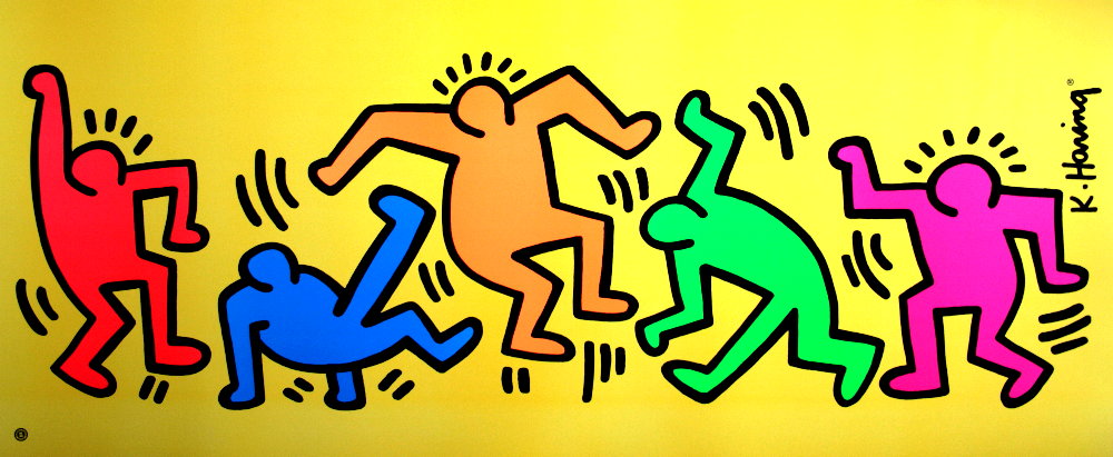
I think a Keith Haring tile might be fun. I came across this work by him:
I thought this could be translated pretty well. I made the tile with similar colors. Then I used a Q-tip dabbed with the Memento archival ink and drew the dancing people.
I had to repeat the ink process about 4 times to end up with this:
I might have to try this one again sometime. It was REALLY hard to remove the alcohol ink where it was thicker, where two or more colors had mixed and settled. I think if I did this again, I might apply a lighter layer of ink applied with a Q-tip or something. Then, the stamp resist with the Q-tip would work out better. But it still gives a nice representation of Haring's painting.
I've also become familiar with Romero Britto's work recently. Super fun, bright and blocky! Perfect for this sort of project. I found this image:
I taped the bold lines off except for the wings. Applied the ink to the different areas. Then I used a Q-tip with one or two dots of the same ink on the top and created the pattern designs by running the Q-tip over the first layer of ink. No Alcohol Blending Solution was used for this tile. Once the background was done. I let it dry for a few minutes. Then I used a Q-tip dabbed with Memento Archival Ink to draw in the wings.
I rinsed the tile with water and the ink was removed (MUCH easier than the Haring tile).
I removed the tape. Then I dipped a Q-tip in the StazOn black ink and drew with it on the tile over the tape lines. I tried to do one consistent line as much as I could. If I lifted up at all or went back over something, the ink lifted up a bit or wasn't quite as dark.
And there you go! A Britto-inspired work on an alcohol ink tile!
What other artists do you think would be fun to try with this process???


