Well, if there is any advantage to living in the Polar Vortex in Minnesota, it's that I have a little time to try and get caught up on 6 months of blog posts. Or at least attempt getting started writing posts. This first post is just a catch-up post of a couple projects to ease my way in. ;-)
First, here's a duct tape notebook my 8 year old made all on her own last summer. She didn't look at anything on Pinterest or online. Just had the picture in her head (my little right-brained learner!) and created this!
Look at that ear detail! It's 3-dimensional!
We had a wonderful nanny last summer and we made these fun little gifts for her as thank you gifts:
She was heading to Virginia Tech for school so we attempted to make her a rainbow loom bracelet in the right colors (really the school color is a little more maroon, but I digress). I just gave the girls some 5 x 7 canvas boards and asked them to make a fun picture, but that I wanted them to use different lines and patterns so here's what they came up with. They used permanent markers to color these.
The bright colors and happy drawings make me think of summer and warmth! :-)
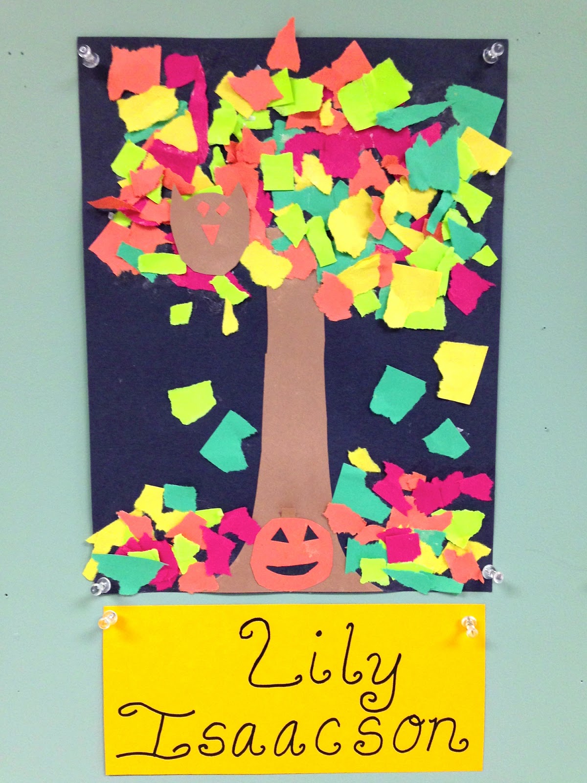
My girls school has an art class once a week after school. Each girl will be artist of the week once during the term. Here are the girls' artist of the week creations for the fall:
These paper sculptures were really cool! I love the 3-dimensional quality of them!
(Sorry the quality of the photos isn't the best, I took them on my iPhone). ;-)
Every summer my kids and I work on one art project a week where they learn about an artist as well as various art techniques and concepts. Join us for our journey into art and art history! The rest of the year we spend crafting and seeing where our creativity takes us!
Showing posts with label Lines. Show all posts
Monday, January 27, 2014
Friday, April 27, 2012
2012: Element Project: Color/Value Project (sort of)
Our other project last weekend was more complicated and more involved than many of our more recent creations. I was going for a project that might take a bit of time to complete while my youngest child napped. This project is conducive to talking about some of the Elements of Art: shapes, color, value, space, and line. We created these lovely paintings that I put up on our art room wall:
We kind of combined two projects I found. One project inspiration has a similar layout to what we created but was about color value (the light and dark of one color). You can see in the photo above that I tried this project as it was supposed to go with my purple circle picture. But as many projects go, we had to adapt and change as we went along. The other inspiration came from the Art is the Best Part of the Day Blog. In their project, they picked two primary colors and created analogous color images and added white along the way to lighten some of the colors.
Okay, let's start with the first part of the project. Creating a shape and lines.
We used a ruler, pencil, and oil pastel to make a shape in the center, then drew only vertical and horizontal lines to fill in the paper. I experimented with black crayon and pastel and thought the pastel would resist the paint a bit more. So we went with that. I'm sure black crayon would work almost as well and be a cleaner alternative.
My original plan was for us to use one color and just keep adding white to create a color value image. However, this was the first time we used our new Biocolor paints. I experimented with the paint a bit while the girls were busy drawing their shape and lines. I was a little disappointed in how the paint covered the space on the page. It was not nearly as opaque as I was hoping for. And you could really see the brush strokes. Also, when I mixed in the white, I had to mix in a LOT of white to get a significant enough value change to show up on the paper. After discovering all this, I decided it would be better for the girls to pick two colors and mix them to create analogous color paintings instead of value paintings.
Isn't it cute how hard they are concentrating and how thoughtful they are while they are working? :-)
Here are their finished paintings:
Lily picked magenta and yellow. I had her paint 8 spots with each raw color. Then I had her mix those two to get an orangey color. After that, she mixed white with each of the three colors to get a lighter version. Hers worked out pretty well!
Ella picked turquoise and red. But when we mixed the two together, we did not get a purpley color as we thought. We got more of a gray muddled color. So she "cheated" a bit and just used the purple paint to fill hers in. She also added white to the three colors to get different values.
Here is my "value" painting. I added a bit of black to get one shade darker than the raw purple color from the bottle. And then I added white several times to get the lighter shades. I also went over my color blocks 2-3 times with the paint drying in between each time. This gave it a much more opaque finish and didn't look quite as watercolor-y. Although, I was a bit disappointed and frustrated at first (I didn't show this to the girls), we adapted the project and it worked out. Now, we have some nice artwork for the art room wall. Once it was underway, this was a fun project.
![]() |
| Top: My 6 year old's, Middle: My 8 year old's, Bottom: Mine :-) |
Okay, let's start with the first part of the project. Creating a shape and lines.
We used a ruler, pencil, and oil pastel to make a shape in the center, then drew only vertical and horizontal lines to fill in the paper. I experimented with black crayon and pastel and thought the pastel would resist the paint a bit more. So we went with that. I'm sure black crayon would work almost as well and be a cleaner alternative.
My original plan was for us to use one color and just keep adding white to create a color value image. However, this was the first time we used our new Biocolor paints. I experimented with the paint a bit while the girls were busy drawing their shape and lines. I was a little disappointed in how the paint covered the space on the page. It was not nearly as opaque as I was hoping for. And you could really see the brush strokes. Also, when I mixed in the white, I had to mix in a LOT of white to get a significant enough value change to show up on the paper. After discovering all this, I decided it would be better for the girls to pick two colors and mix them to create analogous color paintings instead of value paintings.
Isn't it cute how hard they are concentrating and how thoughtful they are while they are working? :-)
Here are their finished paintings:
Lily picked magenta and yellow. I had her paint 8 spots with each raw color. Then I had her mix those two to get an orangey color. After that, she mixed white with each of the three colors to get a lighter version. Hers worked out pretty well!
Ella picked turquoise and red. But when we mixed the two together, we did not get a purpley color as we thought. We got more of a gray muddled color. So she "cheated" a bit and just used the purple paint to fill hers in. She also added white to the three colors to get different values.
Here is my "value" painting. I added a bit of black to get one shade darker than the raw purple color from the bottle. And then I added white several times to get the lighter shades. I also went over my color blocks 2-3 times with the paint drying in between each time. This gave it a much more opaque finish and didn't look quite as watercolor-y. Although, I was a bit disappointed and frustrated at first (I didn't show this to the girls), we adapted the project and it worked out. Now, we have some nice artwork for the art room wall. Once it was underway, this was a fun project.
Friday, May 27, 2011
2010: Art Project 7--Mondrian
A friend of mine just mentioned wanting to do some "painting ala Holly style" with her kids who happen to be on summer vacation. They are living "down under" in Australia right now and her kids just finished up school. All this reminded me that I still have two projects to post from our Art Journal Wednesday series this past summer.
This project centered on the artist Mondrian. One of my favorites! I just realized I was going to link to information about Mondrian, but I used my old art history books when I was talking about him to the girls. I just googled it and didn't find a satisfactory (to me) article. I guess Wikipedia was closest. Here is a quote from Mondrian about his work:
I showed them these two works by Mondrian:
Composition A: Composition with Black, Red, Gray, Yellow, and Blue (1920)
Broadway Boogie Woogie, 1942-1943
This project centered on the artist Mondrian. One of my favorites! I just realized I was going to link to information about Mondrian, but I used my old art history books when I was talking about him to the girls. I just googled it and didn't find a satisfactory (to me) article. I guess Wikipedia was closest. Here is a quote from Mondrian about his work:
I construct lines and color combinations on a flat surface, in order to express general beauty with the utmost awareness. Nature (or, that which I see) inspires me, puts me, as with any painter, in an emotional state so that an urge comes about to make something, but I want to come as close as possible to the truth and abstract everything from that, until I reach the foundation (still just an external foundation!) of things…
I believe it is possible that, through horizontal and vertical lines constructed with awareness, but not with calculation, led by high intuition, and brought to harmony and rhythm, these basic forms of beauty, supplemented if necessary by other direct lines or curves, can become a work of art, as strong as it is true.Of course, I didn't really explain all that to the girls. I mostly explained that some artists paint images we recognize (like a picture of a person, animal or place) and others paint "designs". That was the best way I could describe abstract painting to them without getting too technical. And then I told them that Mondrian liked to use pure colors or colors that weren't mixed with anything else and asked them if they could think of any colors that sounded like that. Ella got it immediately and said the primary colors!
I showed them these two works by Mondrian:
Composition A: Composition with Black, Red, Gray, Yellow, and Blue (1920)
Broadway Boogie Woogie, 1942-1943
The top one is pretty straight forward Mondrian. I asked the girls what the second one looked like to them. They both said "a map!" Yes! I told them that Broadway was a very busy street in New York City and that the painting represented the layout and the "busyness" of the colors were the hustle and bustle of the big city (this would be the idea of rhythm in the work).
Anyway, that was probably more indepth than I needed to get in this post. I was just so impressed with how the girls seemed to "get" some of these really abstract ideas when they were broken down simply.
For this project. I gave the girls a ruler and pencil and asked them to draw three vertical lines anywhere they wanted all the way down the page. And then three horizontal lines all the way across. Then, some smaller lines inside. Then color in what you feel like coloring in. I finished them off for them by drawing in the fatter and skinnier black lines with permanent marker and a ruler.
And here's their creations:
Anyway, that was probably more indepth than I needed to get in this post. I was just so impressed with how the girls seemed to "get" some of these really abstract ideas when they were broken down simply.
For this project. I gave the girls a ruler and pencil and asked them to draw three vertical lines anywhere they wanted all the way down the page. And then three horizontal lines all the way across. Then, some smaller lines inside. Then color in what you feel like coloring in. I finished them off for them by drawing in the fatter and skinnier black lines with permanent marker and a ruler.
And here's their creations:
Subscribe to:
Posts (Atom)